


Selecting a font is more than simply a matter of taste; it may significantly impact the bounce and conversion rates of your website, particularly if you go with an illegible font. Therefore, rather than grabbing the first font you come across, it pays to take some time to choose the ideal font family for your design.
What are Adobe Fonts?
In the realm of design, fonts play a pivotal role in conveying messages and enhancing visual appeal. Among the plethora of font repositories, Adobe Fonts stands out as a go-to platform for designers seeking a diverse array of typography choices. The fonts may be used directly on websites, or synced via Adobe Creative Cloud.
Importance of Fonts in Designing
Fonts are not merely letters arranged in a particular style; they carry the essence of a design, influencing how information is perceived. The right font can evoke emotions, establish a brand’s identity, and significantly impact user experience.
Criteria for Selecting the Best Fonts:
Readability and Legibility
When choosing fonts, readability (ease of reading) and legibility (clarity of individual characters) are paramount. Fonts should effortlessly communicate the intended message without causing strain on the reader’s eyes.
Style and Aesthetics
The visual appeal of fonts contributes to the overall design’s aesthetics. Fonts range from elegant and classic to modern and edgy, allowing designers to match the tone of their projects.
Why Should You Use Adobe Fonts?
Sometimes, when browsing websites offering free fonts, you get what you pay for. While there are plenty of excellent options available, some typefaces have kerning issues, uneven letters, and other minor issues that will only make your job more difficult.
You will find it difficult to exchange work among several people if you locate a beautiful font on a website but your team hasn’t licenced that specific set. Make sure that typeface is loaded on every device you use, even if you’re working alone. Occasionally, these fonts may not work with the software of your choosing, rendering the entire exercise pointless.
Your choice of typeface is available in all Creative Cloud apps when you use Adobe Fonts. As fonts are loaded straight from the cloud, you won’t need to worry about corrupted fonts. The best part is that if you have a cloud subscription, this library is free.
Top Fonts on Adobe Fonts
10. Termina

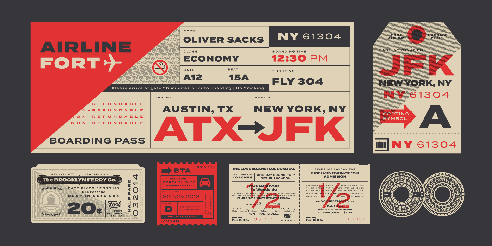
Termina is a sans-serif typeface designed by Mattox Shuler and released through Fort Foundry in 2015. The design features wide proportions and a large x-height, which allows it to be set at small sizes and still remain legible, especially when set in all caps. The family is available in nine weights but without italics.
9. ITC Benguiat

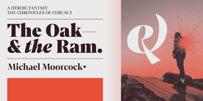
Ed Benguiat, a Brooklyn-born type designer and letterer, created the serif typeface ITC Benguiat in 1977. The Art Nouveau movement served as inspiration for the design, which has high-waisted capitals and a big x-height. Anyone who grew up in the 1980s, like me, will remember the book covers from the Choose Your Own Adventure series with nostalgia because of the use of this font. ITC Benguiat was heavily featured in the 2016 Stranger Things logo, a throwback Netflix series set in the 1980s. The family comes in condensed styles and three weights with corresponding italics.
8. Neue Haas Grotesk

The original, pre-digital Helvetica is not the same as the Helvetica we see in the digital world today. Because Helvetica has been modified over the years to accommodate different typesetting processes, many of its subtleties have been lost in translation. Helvetica’s original name was Neue Haas Grotesk, and type designer Christian Schwartz has worked to correct history by resurrecting the original Helvetica typeface.
7. Baskerville

Baskerville is a serif typeface designed by John Baskerville in 1757. The design was intended to improve upon the legibility of the Old Style typefaces of William Caslon. Baskerville has a beautiful italic ampersand which I use for the Typewolf badge.
6. Acumin

Robert Slimbach created the sans-serif font Acumin, which Adobe released in 2015. Slimbach’s goal was to create a modern take on the neo-grotesque that could be used as a typeface. Acumin, according to designer Jeffrey Zeldman, is “a Helvetica for readers.” Acumin is a large family of typefaces that comes in five widths: super condensed, semi-condensed, condensed, regular, and wide. Nine weights and matching italics are available for each width. This adds up to a staggering ninety styles in total.
5. Stratos

Stratos is a sans-serif typeface designed by Yoann Minet and published in 2016. The design features a condensed uppercase combined with a lowercase of normal proportions. The family is multiplexed, which means each of its ten weights shares the same width.
4. Gill Sans
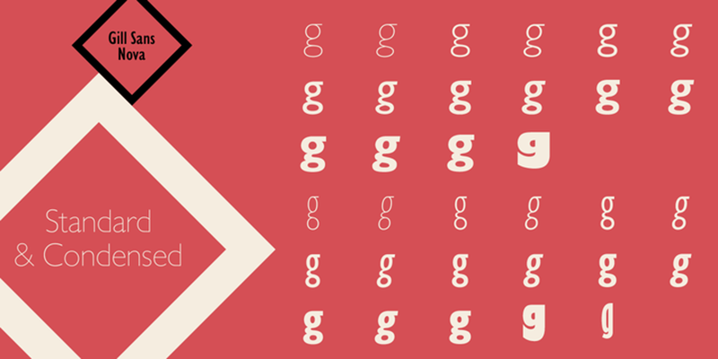
British designer Eric Gill created the humanist sans-serif typeface Gill Sans in 1926. The London Underground’s Johnston typeface, created by Edward Johnston, served as the model for the design. Famously, Gill Sans was utilised for the timeless, understated Penguin Books cover designs.
3. Marshmallow

Marshmallow Fluff and Marshmallow Script, two members of the Marshmallow font family, will give your designs a lighthearted and carefree vibe. This typeface is great for headers and posters, but you won’t want to use it for writing essays. Neil Summerour is a designer, calligrapher, type designer, and lettering artist.
2. Neue Kabel
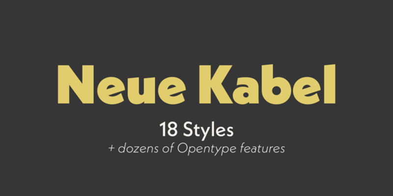
Rudolf Koch created the geometric sans-serif typeface Kabel in 1927. Over the years, it has been released under several names by different foundries, such as Geometric 231, Koblenz Serial, and TS Koblenz. The 1975 publication of ITC Kabel had an oversized x-height, a characteristic of the phototype of the time. In the 1970s, Kabel Black, a hefty version with short descenders, was widely utilised. Marc Schütz created a thorough redesign of Kabel in 2016, which Linotype released as Neue Kabel (shown in the specimen), available in nine weights with coordinating italics.
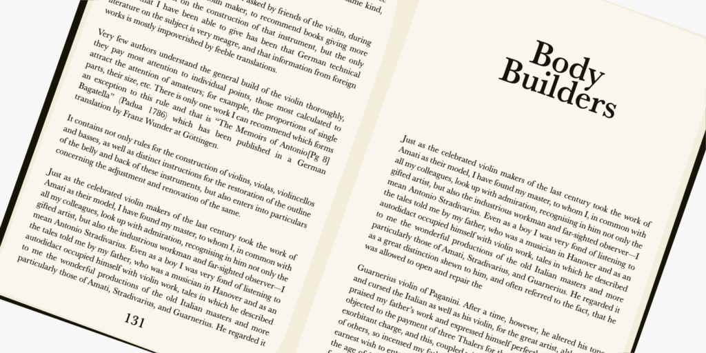
1. Merriweather

This adaptable serif font seems contemporary without being overly dramatic. The Light Regular weight of the typeface is ideal for body material in magazines or company reports, while the italic variations exhibit a subtle elegance. For current affairs publications, the UltraBold Regular font serves as a serious headline font.
Merriweather can create a typographic storm when you’re feeling uninspired by text standards like Times and Garamond.
Summary
Millions of designers use Adobe Fonts. By using strong typographic and iconographic principles, they improve the ease of use, transparency, speed, and accessibility of the web.
The world of design thrives on the versatility and impact of fonts. With Adobe Fonts offering a spectrum of choices, designers can elevate their creations by choosing fonts that resonate with their vision and purpose.
FAQs
1. Are Adobe Fonts free to use?
Yes, Adobe Fonts offers a selection of fonts included with Creative Cloud subscriptions, and some are available for free with limited access.
2. Can I use Adobe Fonts in commercial projects?
Absolutely. Adobe Fonts can be used for commercial purposes, providing flexibility for various design needs.
3. How do I access Adobe Fonts?
Adobe Fonts are conveniently accessible through Creative Cloud applications or via web access.
4. Can I customize Adobe Fonts?
While you can’t directly modify the fonts, you can adjust attributes like size, weight, and style within design software.
5. Are Adobe Fonts compatible with different design software?
Yes, Adobe Fonts seamlessly integrate with popular design tools like Photoshop, Illustrator, and InDesign for a smooth workflow.