

How to improve your UI/UX design with Visual Hierarchy

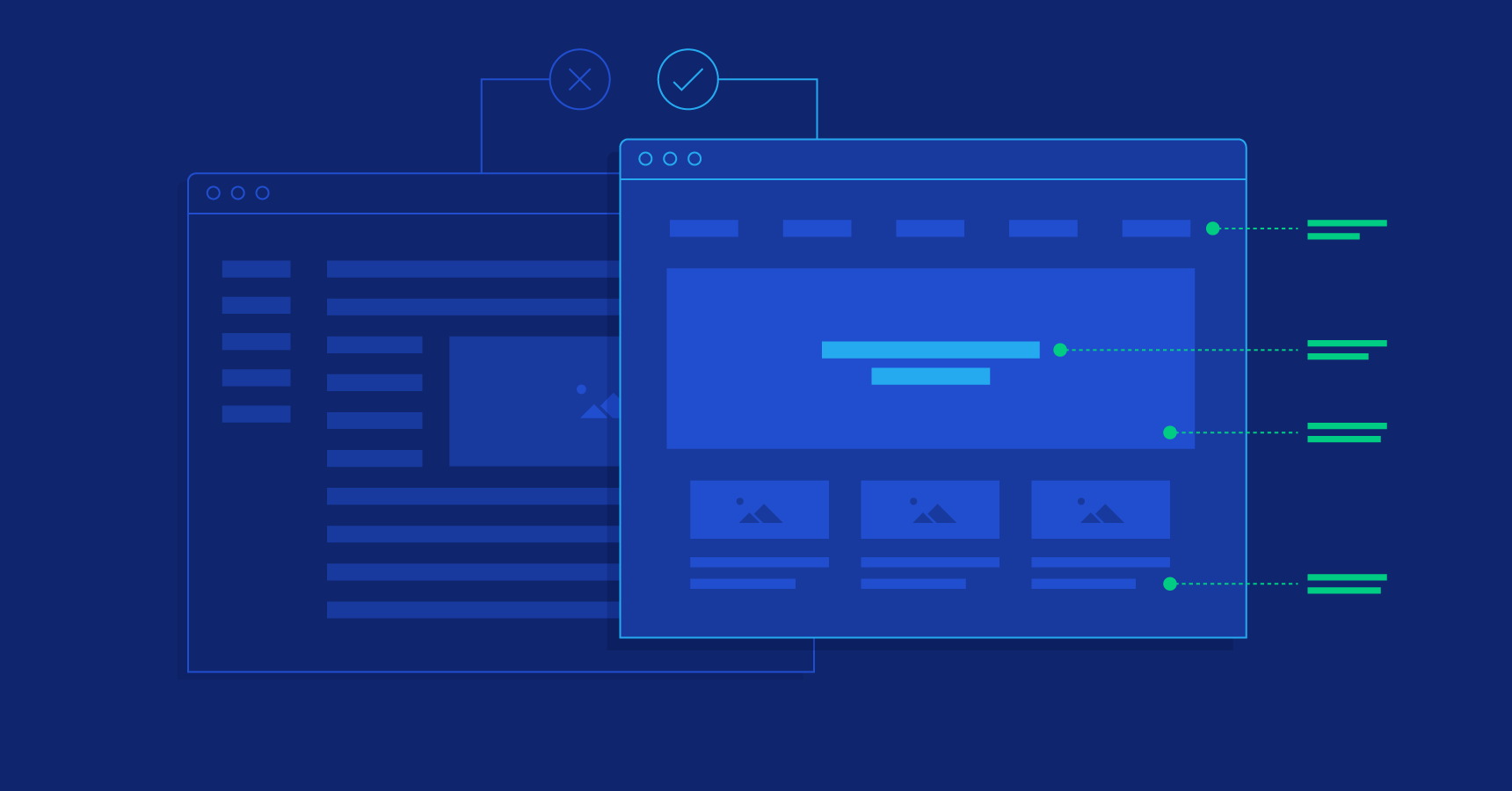
Visual hierarchy in UI/UX design refers to the arrangement of elements on a page or screen in a way that guides the user’s attention to the most important information first. It helps users understand the structure of the content and navigate the interface efficiently.
There are several ways to create visual hierarchy in UI/UX design:
Contrast: Using contrasting colors, typography, and sizes to draw attention to specific elements. For example, using a larger font size for headings and a smaller font size for body text helps users understand the structure of the content.
Proximity: Grouping related elements together creates a visual connection between them, making it clear that they are related. This can be used to separate different sections of content or to group together form fields and their labels.
Alignment: Aligning elements with one another can create a sense of order and balance in the design. This can be done horizontally, vertically, or both.
Repetition: Repeating elements like color, typography, or icons can create consistency and help users understand the structure of the interface.
Direction: Using visual cues like arrows or lines to guide the user’s eye can help lead them through the interface.
By using these techniques, designers can create interfaces that guide users’ attention to the most important elements and make it easy for them to find the information they need.
And also keep in mind that The visual hierarchy that works for one interface or design may not work for another, so it’s important to consider the specific goals and context of the project when creating a visual hierarchy.